

Portfolio
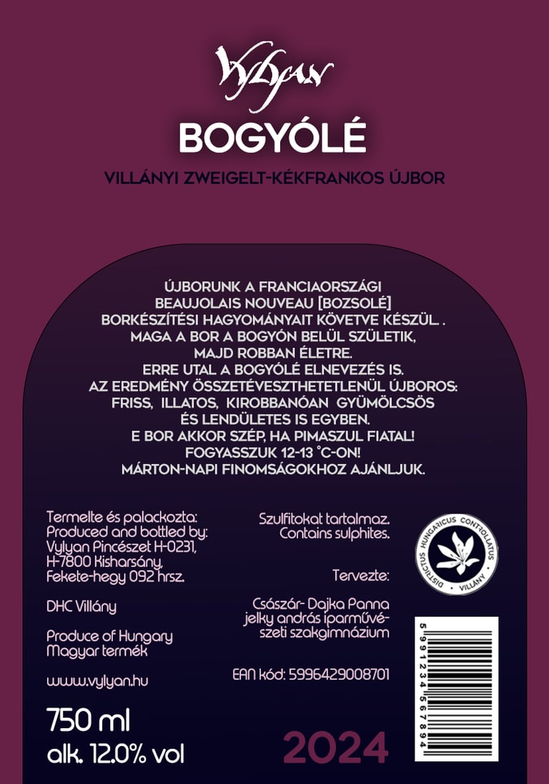
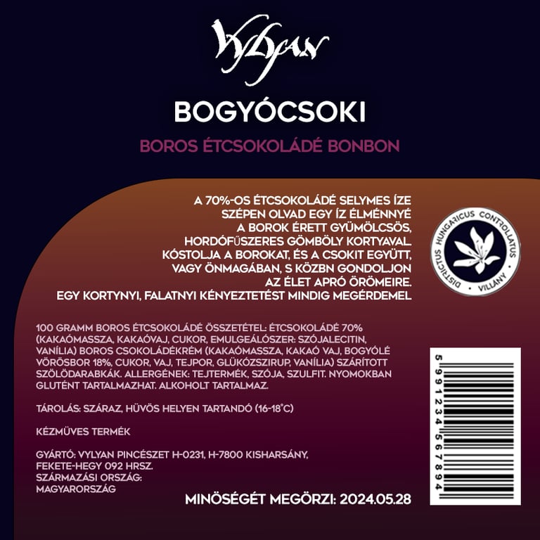
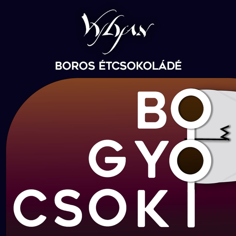
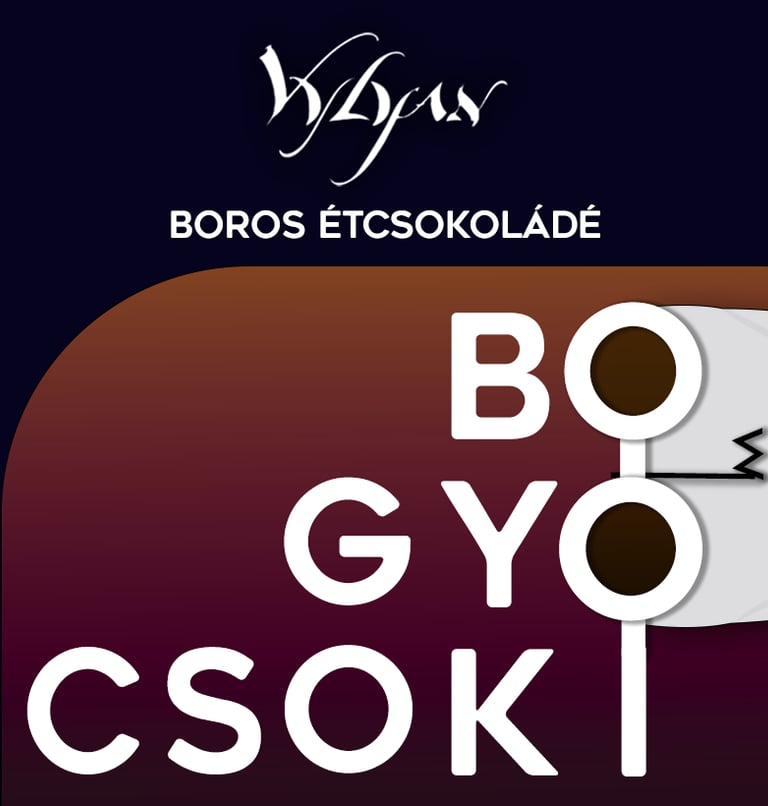
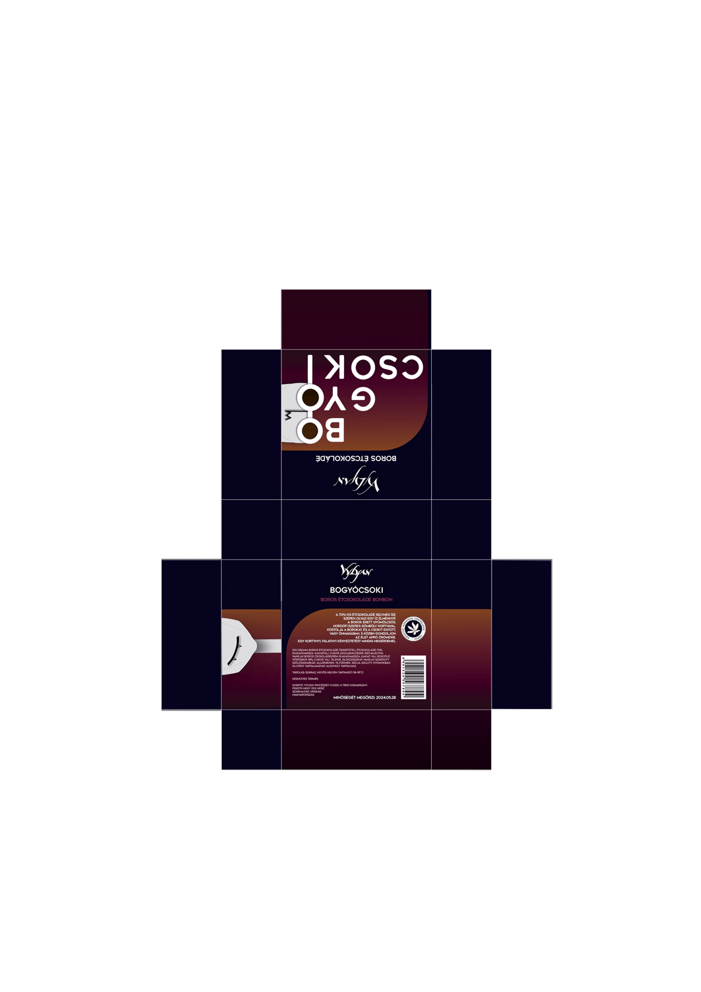
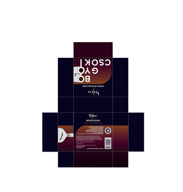
Bogyólé & Bogyó csoki
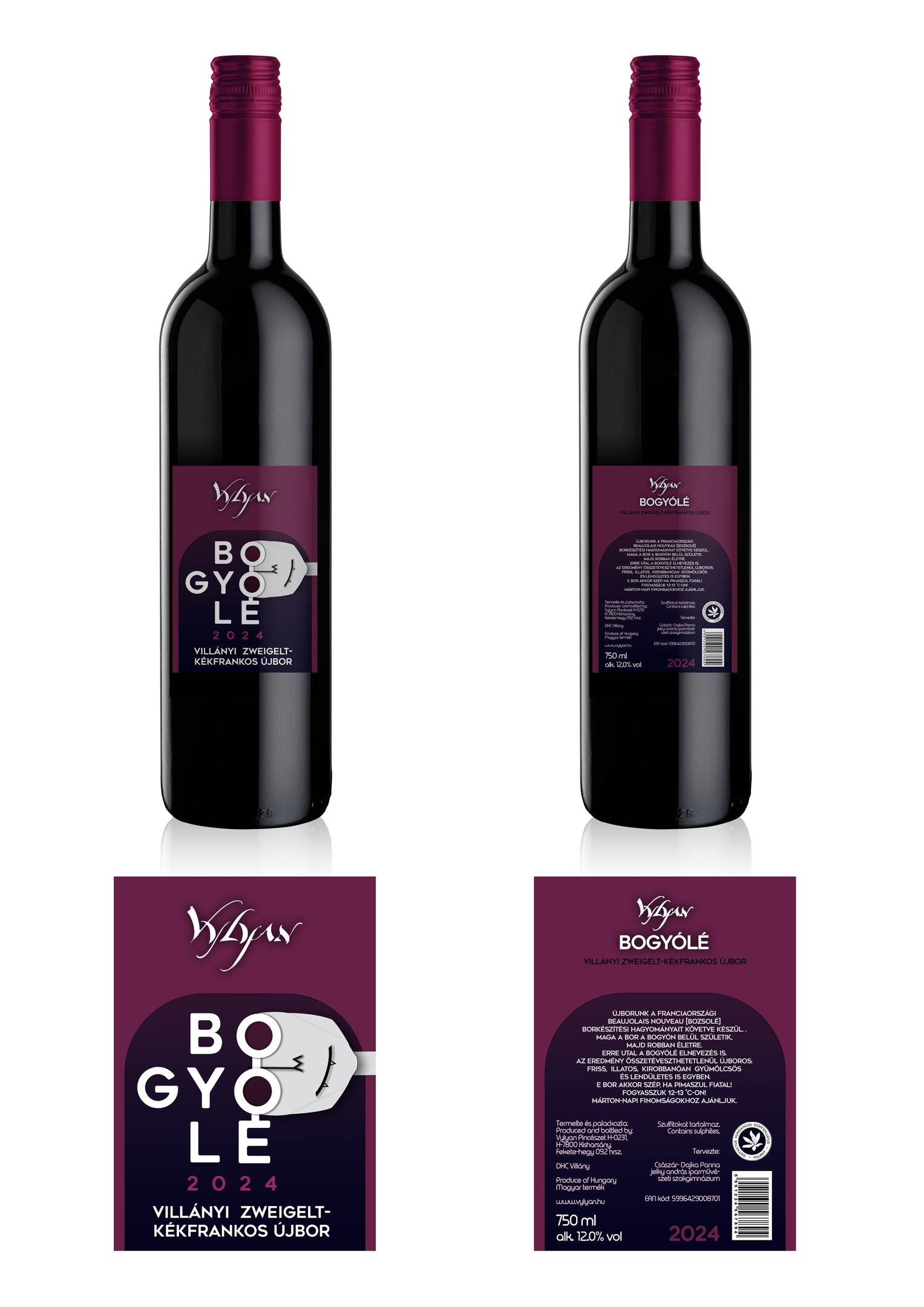
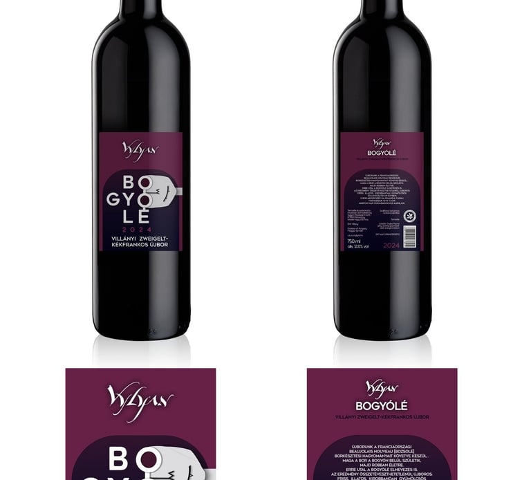
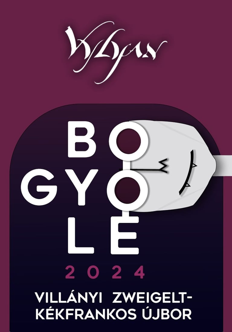

Packaging Design
Brand Identity • Digital Design
Simple, modern wine label and chocolate packaging with geometric forms, where playful typography and rounded, clean-lined elements define the design’s character.
The Bogyólé label design was created as a course project focusing on brand identity and packaging design. The goal was to develop a visual identity that simultaneously evokes the wine’s light, fruity character and conveys a modern, youthful aesthetic. The design for the accompanying dark chocolate box was developed based on the wine label’s graphic system, ensuring that the two products received packaging that is harmonious yet recognizable on its own.
Holland Design Fesztivál
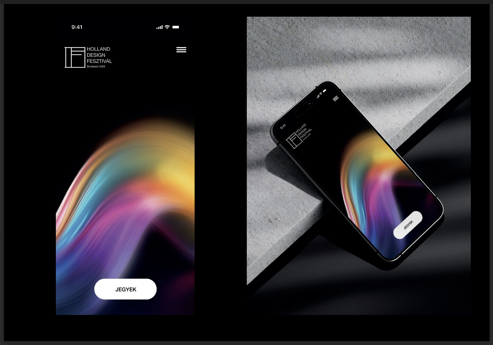
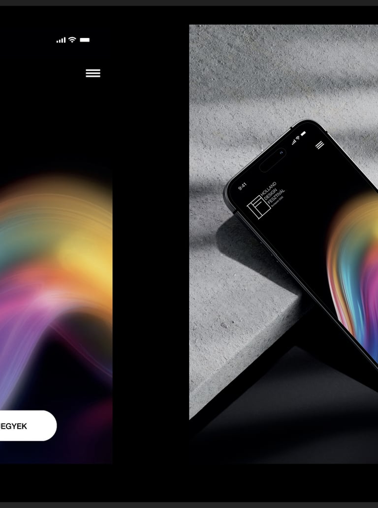
Complete Brand Identity Design
Brand Identity • Digital Design
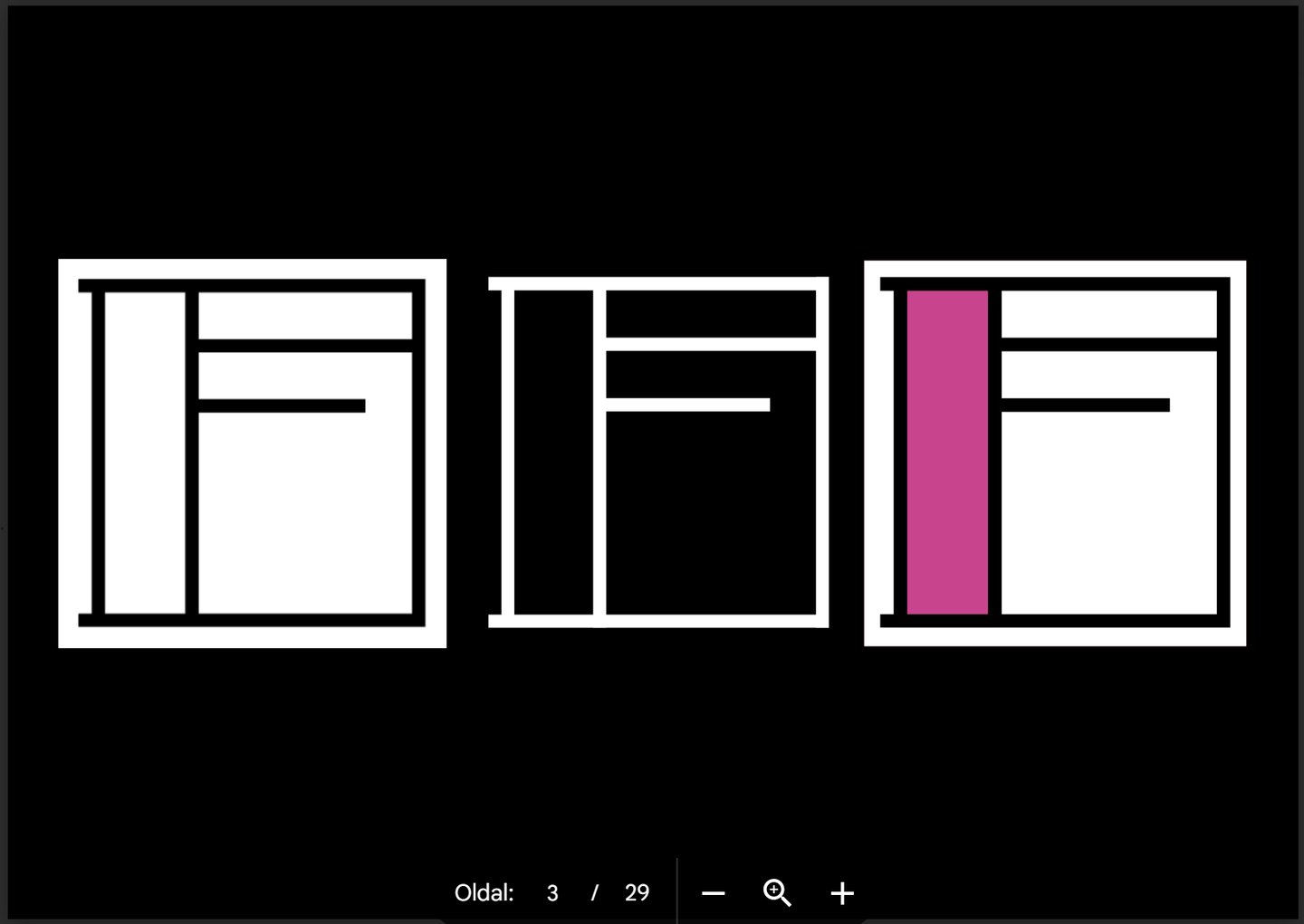
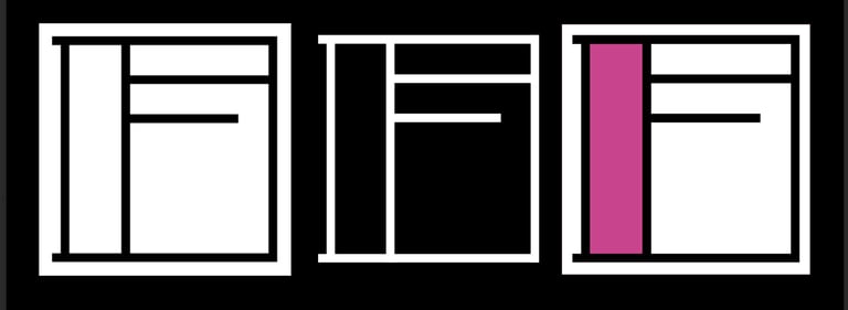
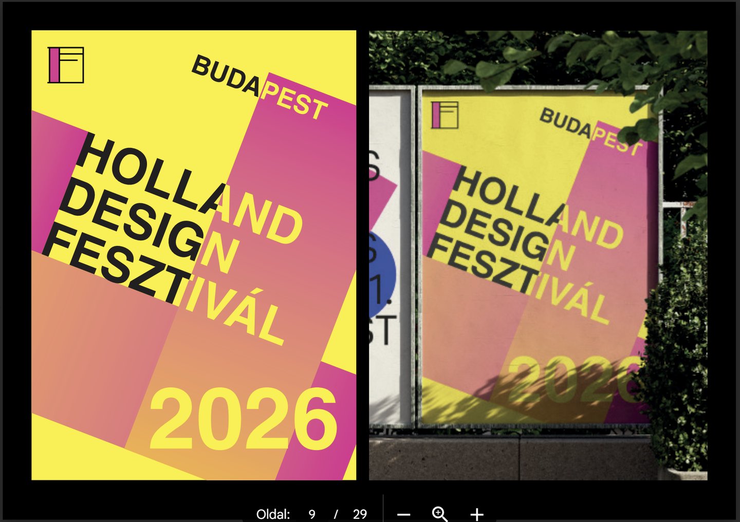
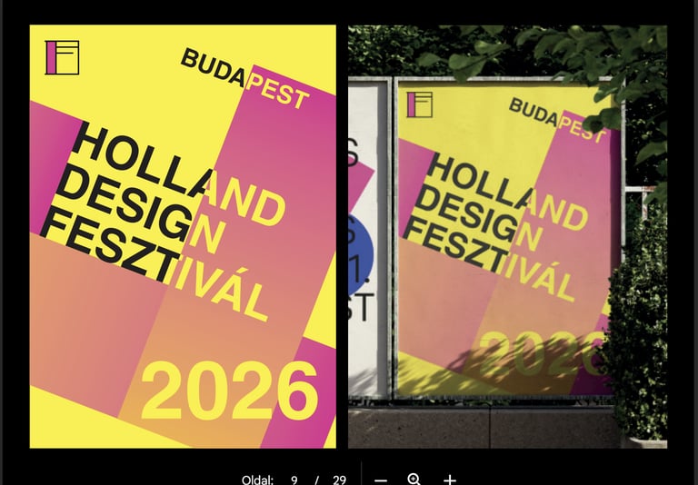
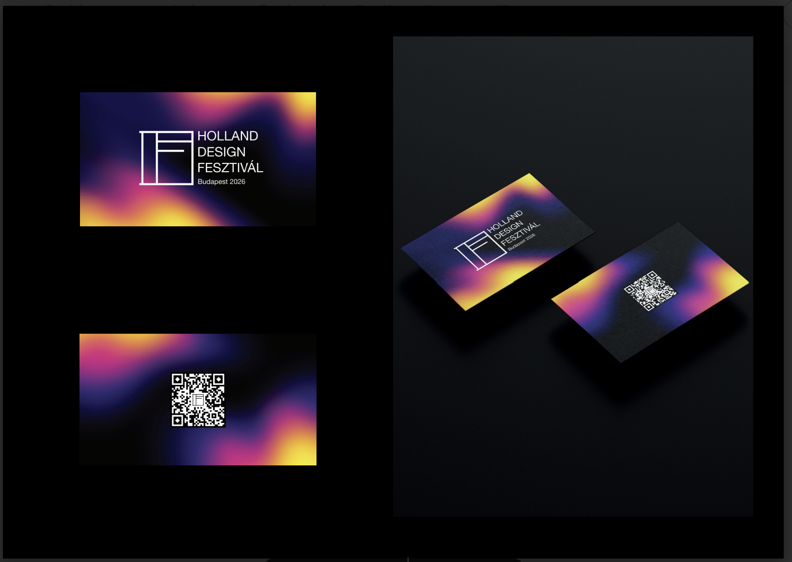
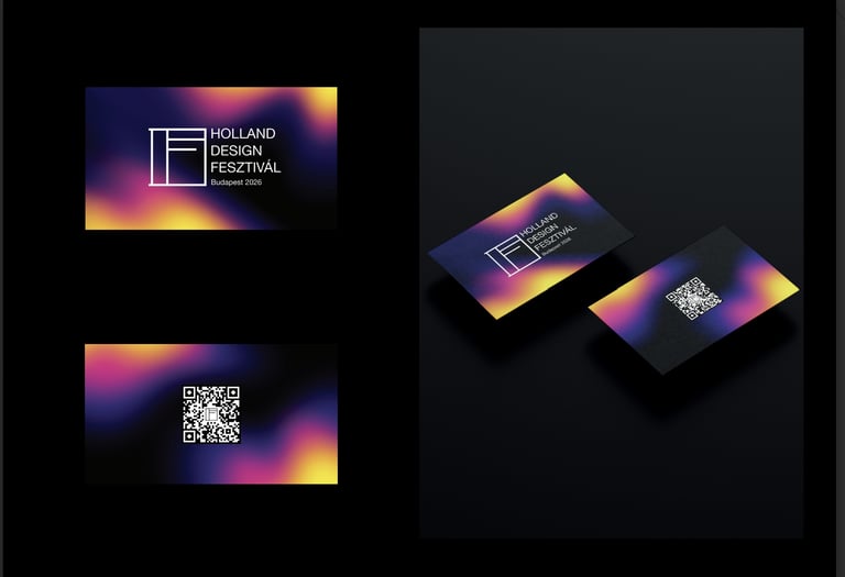
Geometric, colorful, and minimalist festival identity based on strong contrasts, clean lines, and modern typography. The black-and-white logo is complemented by pink, blue, and yellow elements, creating a cohesive, modern, and dynamic visual world.
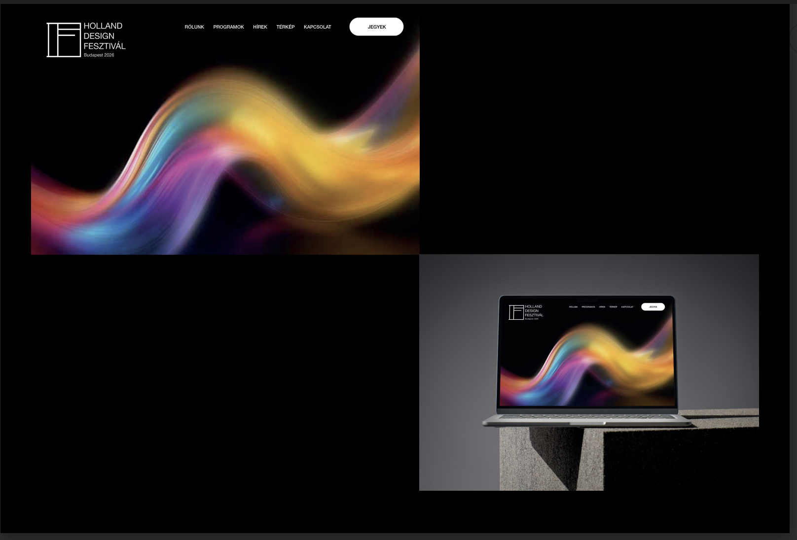
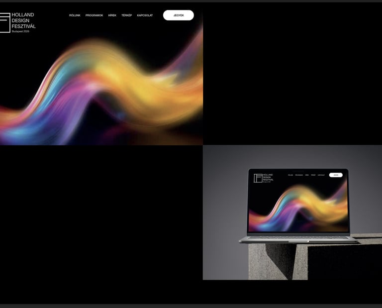
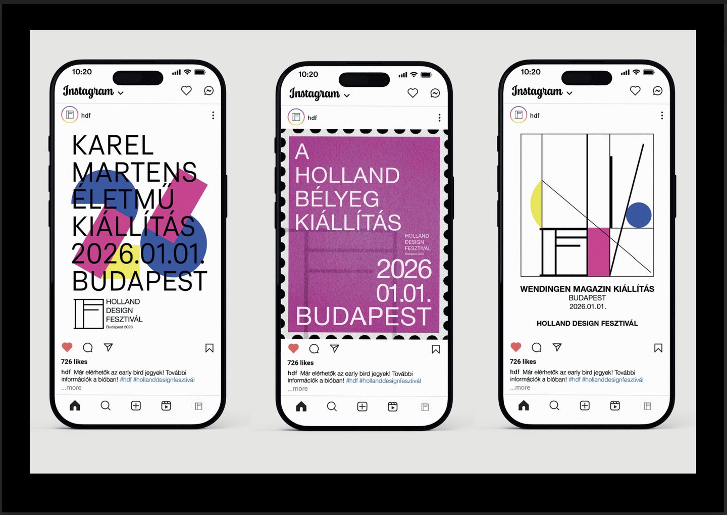
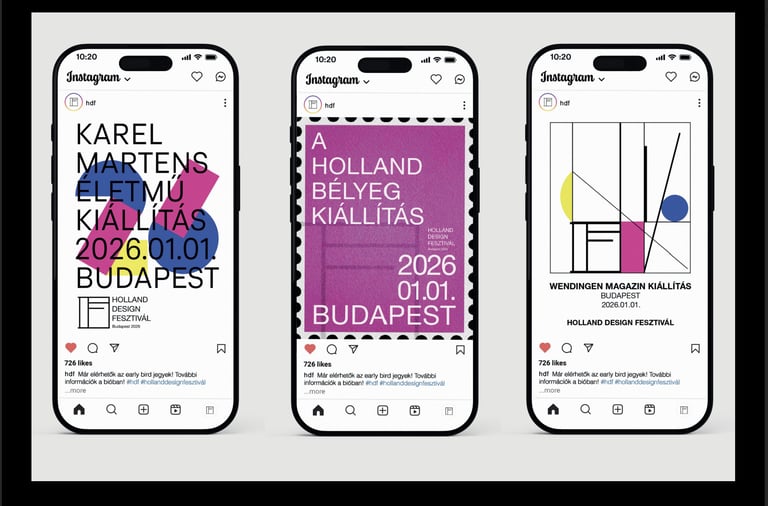
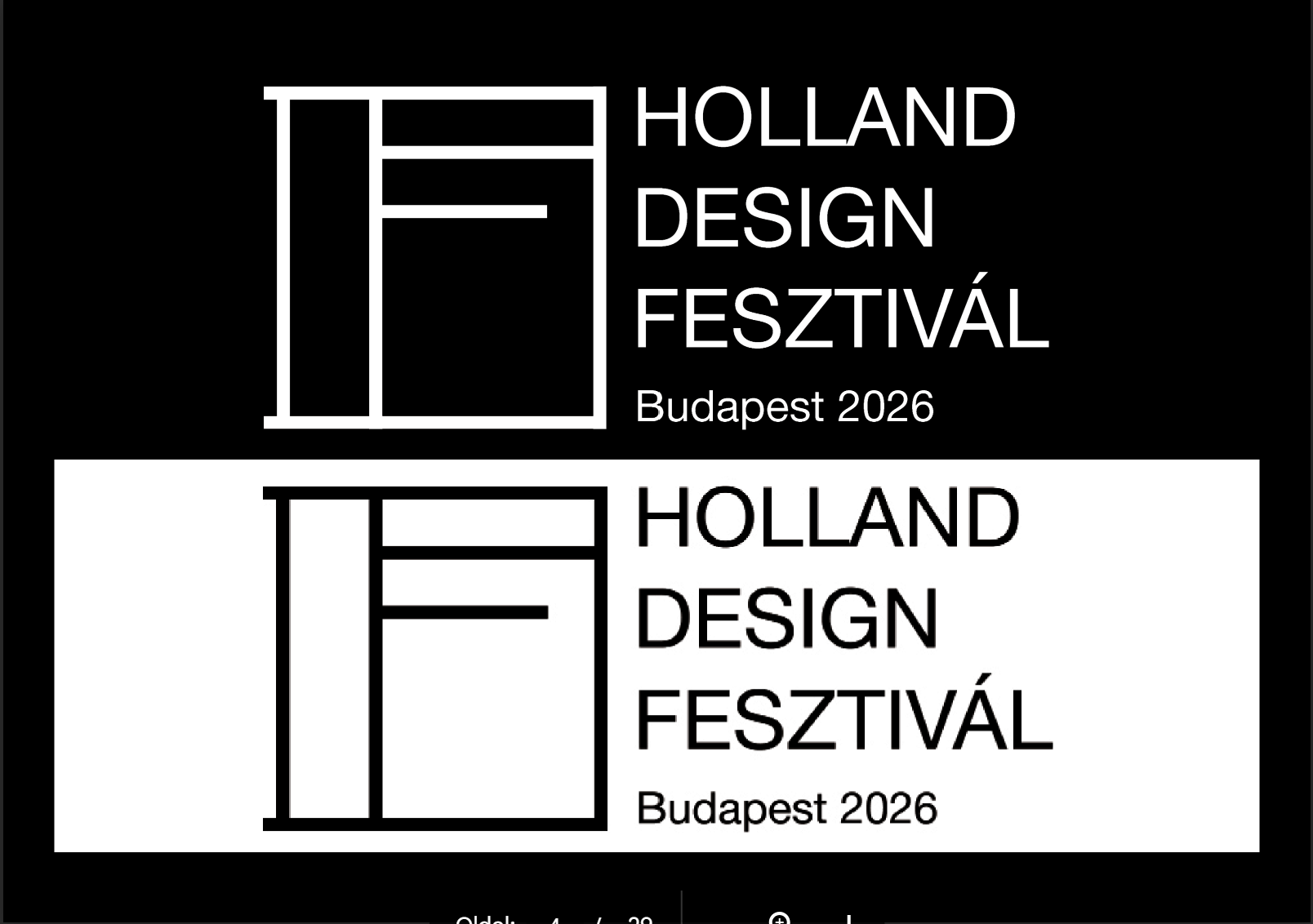
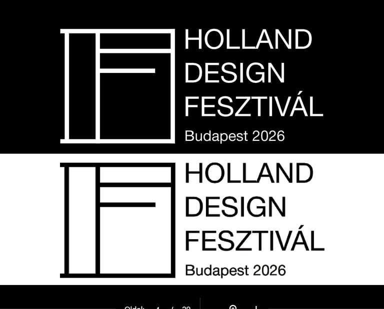
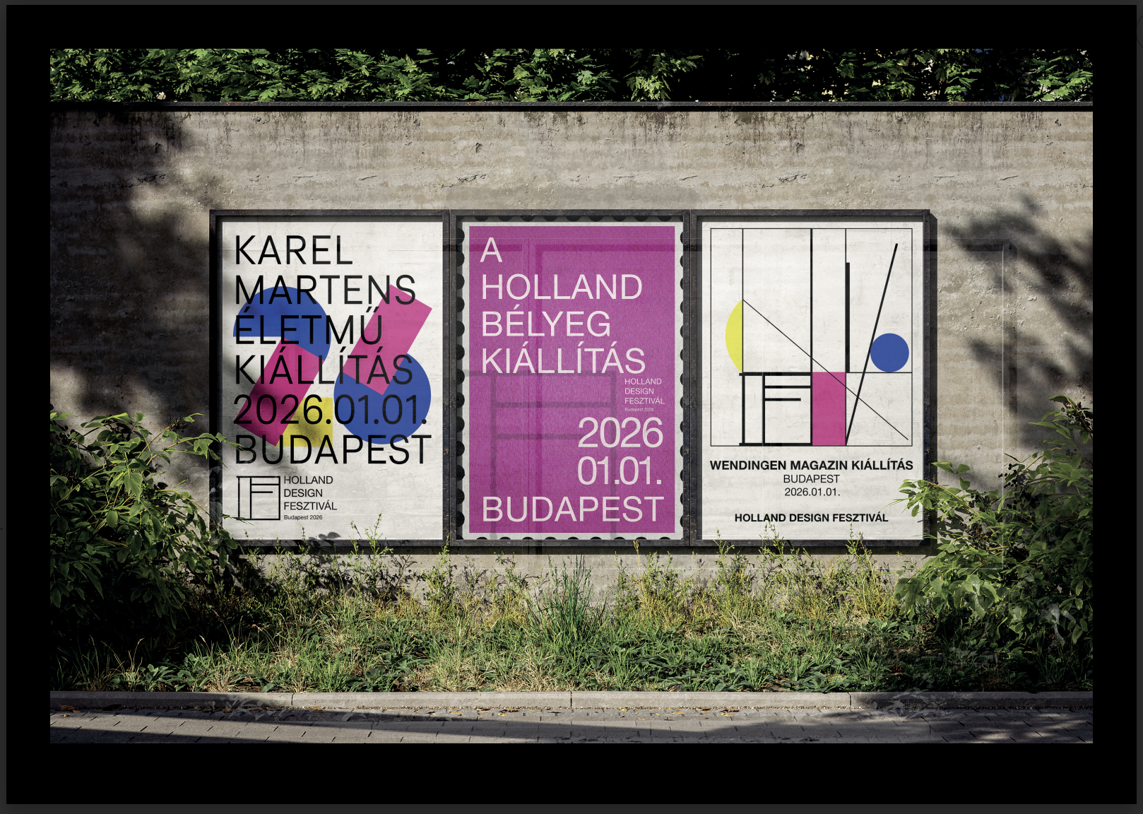
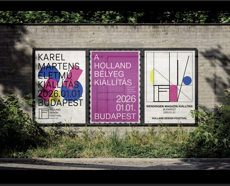
The visual identity of the Holland Design Fesztivál was created as part of a design project. The design was based on three primary colors—red, blue, and yellow—as well as the initials of the Holland Design Fesztivál, from which I developed a geometric logo inspired by Mondrian’s paintings. A three-part poster series was also created for the brand identity, reflecting the themes of the festival’s various exhibitions. The standalone, yellow-based poster serves as a visual summary of the entire event. For the web design and business cards, the goal was to ensure that the modern, dynamic aesthetic harmonized with the brand identity system based on primary colors.
Davidacuts
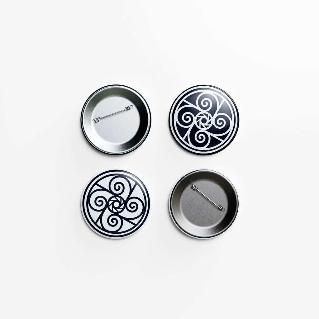
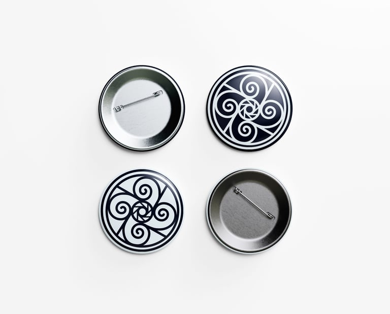
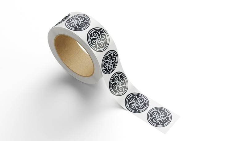
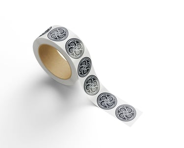
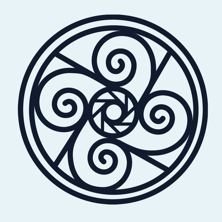
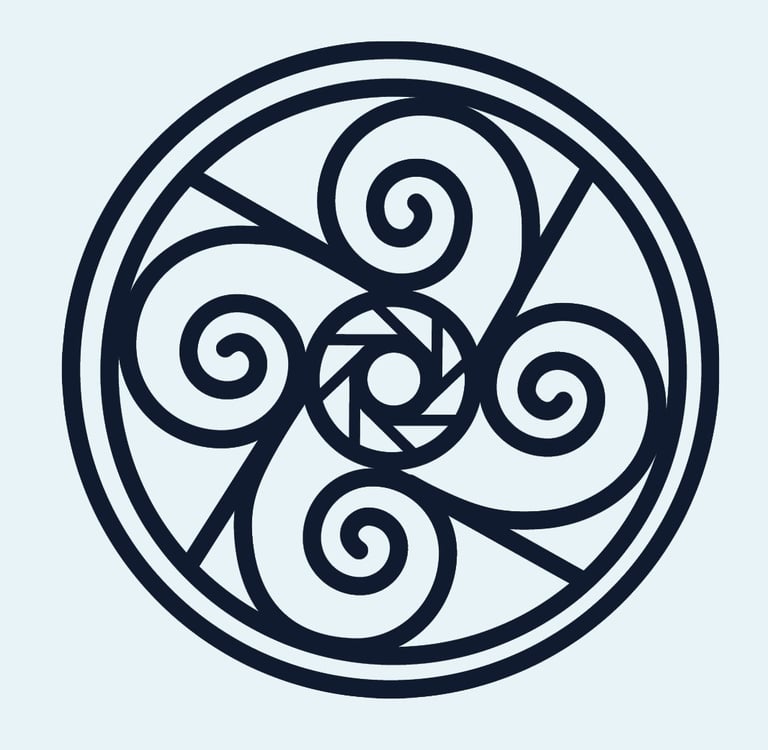
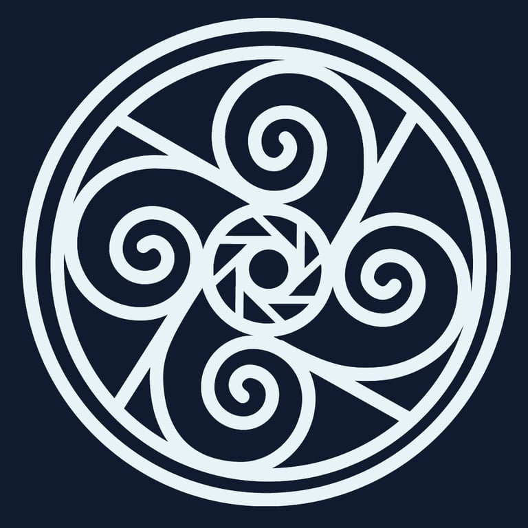
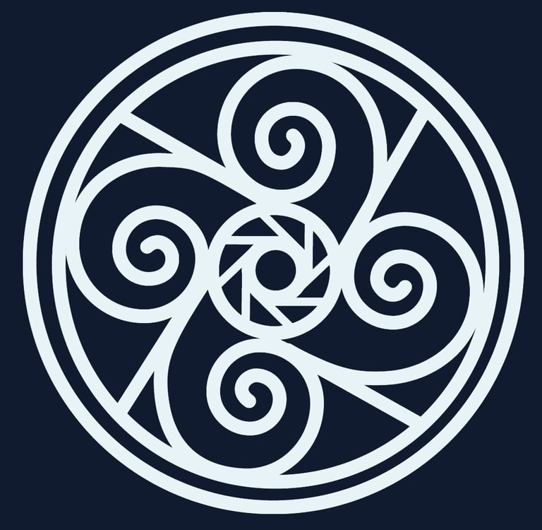
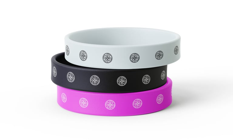
Logo Design
Brand Identity • Logo Design
Symmetrical, geometric logo that captures the client’s world through a combination of dark and light blue, clean lines, and circular motifs. In addition to the basic design colors, the wristband mockup also features pink, creating a bolder, more playful version tailored to the client’s future use cases.
The starting point for the logo designed for the photographer Davidacuts was photography itself. The icon’s design was inspired by the aperture of a camera lens, the proportions of the Fibonacci spiral, and the triskelion symbol. These elements came together to create a circular composition made up of repeating elements, which simultaneously references the world seen through a camera lens, movement, and an awareness of composition. The logo can be used in multiple color variations, making it well-suited for digital platforms, pins, stickers, or wristbands.